Widget Structure & Implementation
Widget Structure
Below is a summary of the widget content based on the following sample.
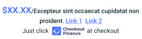
- $X.XX = calculation is based the promotional information hosted by ChargeAfter.
- Excepteur sint occaecat cupidatat non proident = Text is determined by the lender and will generate dynamically from ChargeAfter. The text is not customizable by a merchant.
- Link 1 and Link 2 = Links can be set up to launch the promotional modal or apply flow. The promotional modal displays additional details about the promotion in the widget. Text can be customized by merchant using CSS.
- Just click [brand] at checkout = Optional block that can be hidden. If visible, the text is customizable by merchant using CSS.
- Brand/logo = Rendered dynamically from assets hosted at ChargeAfter.
Changing the Widget Content
Overriding or changing the widget content is not advised and will create a compliance risk with your financing provider.
Widget Styling
The default font size is 12-14px.
Note: The text size, weight and color is subject to lender approval.
Merchants can customize the widget styling using CSS if approved by the lender. Once the lender approves, if the merchant has sufficient HTML/CSS skills they can make adjustments to fit their website. For those merchants who don't have the resources, ChargeAfter has some styling variants we can offer.
You can find examples of commonly used widgets on the Widget Samples page.
The widget also has support for dark-themed websites, using a variant ID that is provided by ChargeAfter.
Implementation
To implement the default widget, use data-widget-type = "default-template" or keep this attribute empty.
The widget will display the promotions with the lowest monthly payment. Depending on link configured, the user can launch a modal to start the prequalification application process or review promotional details based on:
- Item price
- Promotional codes configured for the merchant
This widget uses the following attributes:
- data-widget-type: “default-template”
- data-widget-item-sku: “[your-product-name]”
- data-widget-item-price: “[your-product-price]”
- data-widget-financing-page-url: “[your-financing-page-absolute-url]”
- data-widget-profile-id: ChargeAfter id references to a specific widget configuration.
- data-widget-item-tag: Optional attribute used for promotion targeting, see below.
<div class="ca-promotional-widget"
     data-widget-type="default-template"
     data-widget-item-sku="PRDCT2"
     data-widget-item-price="250"
     data-widget-item-tag="TAG123"
     data-widget-financing-page-url="www.merchant.com/financing-info-page">
</div>
Apply From the Widget!
There's an option to enable customers to apply for financing ahead of checkout, directly from the widget. This is a highly effective way to increase sales and AOV.
Targeted Promotions
In addition to price, the widget can also display promotion based on a product category.
To apply promotions to a single product or group of products the data-widget-item-tag can be used to pass a value used. A promo code for promotions configured for the lender/provider in the merchant's waterfall will be provided. Contact our support team for assistance.
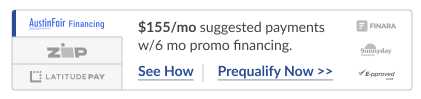
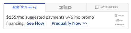
Multi-Lender Widget
The multi-lender widget will enable retailers to market promotions for multiple payment providers.
This widget uses the same attributes noted in the implementation section above.
Horizontal view:
Vertical view:
Widget Application Callback
Once application flow is completed from widget, a callback is triggered in which the SDK passes relevant data to the hosting merchant.
See SDK Completion Callback for more info.