Adding the Checkout Button
Prerequisites
The code requires the SDK to be loaded in the current page.
Add the HTML or React snippet below as a checkout option. The ChargeAfter SDK will locate it and replace the element with the relevant button design based on your ChargeAfter configuration.
<a href="javascript:void(0)" class="ca-checkout-button" data-button-type="medium-generic" onclick="ChargeAfter.payments.present('checkout',opt);" />
import { checkout, ICheckoutProps } from "@chargeafter/payment-sdk";

const checkoutButton = () => {
  const cfg: ICheckoutProps = {
    config: {
      //optional - use in case of more than a single store
      storeId: "<storeId>",
      env: {
        name: "qa",
        apiKey: "<your api key>"
      }
    },
    callback: (token, data, status) => {},
    cartDetails: {
      items: [],
      taxAmount: 5,
      shippingAmount: 6,
      totalAmount: 7
    }
  };
  const onClick = async () => {
    try {
      const { consumerId } = await checkout(cfg);
      console.log(consumerId);
    } catch (ex) {
      console.log(ex.message);
    }
  };
  return <button dataButtonType="small-generic" onClick={onClick}>Click to checkout</button>;
};
The above code adds a pre-rendered clickable button that presents the Checkout UI with some opt object. You may change the callback function so that when the button is clicked, your custom function (in which you will call ChargeAfter.checkout.present) will be called.
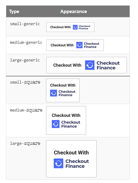
You can set the data-button-type attribute according the space available to you:
- small-generic
- medium-generic (default)
- large-generic
The image below is an example of one of the button options, in different sizes. (Specific branding is determined by the setup of the specific financing program.)

Make Your Own Button
If you wish to further customize your checkout button, you may do so. Please contact ChargeAfter's merchant onboarding team for guidance and relevant visual assets.
Updated over 1 year ago
